NYC's air quality is generally good, but often varies
Our air quality is pretty good and has been improving over time. For PM2.5 (fine particles in the air), NYC meets the national air quality standard of an annual average of 12 μg/m3.
But hour to hour, there's large variation in our air quality - even in neighborhoods with the cleanest air. That means sometimes, New Yorkers are exposed to high levels of pollutants like PM2.5 that can harm health.
These high levels are driven by daily changes in traffic volume, weather patterns that can trap emissions, and other short-term events.
Air quality varies because sources vary
In New York City, about 45% of PM2.5 comes from far-away sources, like coal-burning power plants in the Midwest. But the rest comes from local sources.
When we study air quality in every neighborhood of the city, we're able to identify the sources that are most closely associated with higher levels of air pollution.
Building density affects a neighborhood's air quality because like vehicles, buildings burn fuel and emit pollutants: their boilers burn oil and gas to produce heat and hot water. This is one reason we often see more air pollution in the winter.
Because of new heating oil regulations, PM2.5 has gone down dramatically, and SO2 levels are now indetectable. Read more at the NYCCAS annual report.
Industrial areas affect a neighborhood's air quality because of diesel exhaust from trucks idling and traveling through industrial areas, and from industrial combustion equipment.
Traffic density affects a neighborhood's air quality because engines produce PM2.5, black carbon, and NOx. While electric vehicles help reduce emissions, all vehicles also contribute to PM2.5 through tire wear and braking. Traffic volume is one reason we often see daily spikes in PM2.5 concentration in the mornings and evenings.
Truck traffic density affects a neighborhood's air quality because diesel combustion produces additional pollutants.
Common patterns
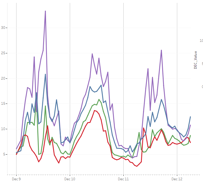
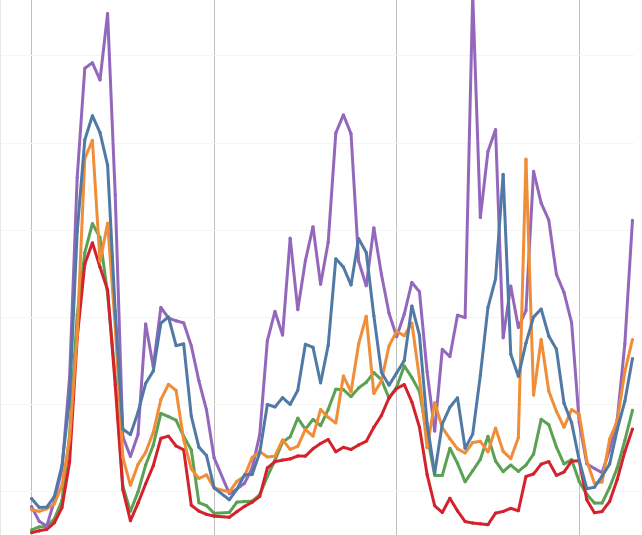
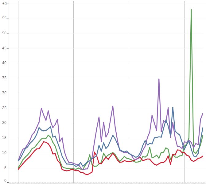
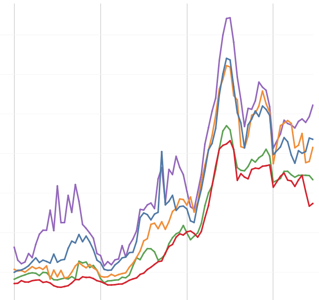
We often see air quality data take the shapes below. Take a look at the images and see if you can see similar patterns in today's data - or come back tomorrow to check.
The monitors are in neighborhoods with different emissions sources, so have different PM2.5 levels. Midtown has the highest traffic density, usually has the most PM2.5. Queens College, with the least traffic, often has the cleanest air.

PM2.5 levels rise in the morning as traffic volume increases. These temporal differences (spikes) are usually greater than spatial differences (the differences between neighborhoods).

Sometimes there are dramatic spikes at unexpected times, and without having a camera on each monitor, we don't know what causes them - however, they can be explained by something as simple as a truck idling for a few minutes underneath the monitor.

Weather can trap emissions and cause PM2.5 to build up. Sometimes we see a clear west-to-east pattern in rising PM2.5, likely related to a weather pattern moving in to New York City and causing pollution levels to rise as emissions are trapped.

Hourly PM2.5 measurements from 5 AQ monitors
PM2.5, in micrograms per cubic meter (μ/m3)"What about my neighborhood?"
We don't have real-time data for every neighborhood in New York City. However, we use our network of air quality monitors and a huge dataset of sources factors to model air quality based on key factors that affect air quality. To find out about air quality in your neighborhood, click the button below.